PASSION - LOVE - DESIGN
Menu
Branding, Logo Design, Website Design

The
Catalyst Cube

Scroll Down
01

SCOPE

Logo Design

Branding

Website

Brochure Design


02

THE CHALLENGE

The Catalyst Cube is a business consulting firm that aims at providing business coaching and sales strategy. The level of engagement is too high and it needs a perfect platform to engage its clients. To make that platform, the company wanted its brand to be elegant and simple. Simplicity is a form of elegance.

They also needed a website that is classy. Most of their clients are in the IT field. IT field is famous for a corporate look which mostly falls in the shades of gray.
03

WEB DESIGN

The website of a business consulting firm needs to be standing unique from its competitors. The CEO of the Catalyst cube Mr. Rajesh Prabhakar wanted the website in a gray theme that solely marks the corporate people.

They wanted to show their level of engagement by positioning them among the big players in the market. The website acts as the front face of the firm and it speaks for their firm. We were very careful on developing the face and most of our concern was based on user experience.
04

THE BEGINNING

The logo needs to be simple yet memorable. It must have a bold statement. The catalyst is a substance in a chemical reaction that is either used for acceleration or deceleration of the process. The same way the catalyst cube is a firm that helps business people to improvise their sale and marketing tactics.
05

BRAND DEFINITION

Defining the brand creates an objective roadmap; a decisional filter for all the company’s future decisions. By checking against this statement, we can quickly see whether any decisions will help or hurt, focus or muddy, purify or modify the brand.

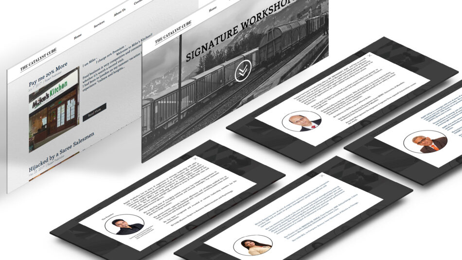
Catalyst cube is a firm that maintains its class and provides the best service to its clients in a friendly way. They approach the problem of the client as it is one of theirs and gain a strategic advantage over their competitors.

An in-depth strategy session was conducted at their office space and Vignesh Gopal understood the sole key of the company and their services which helped us define their brand.

06

OUTCOME

We came up with a simple letter form logo and grey-themed website. The company had different courses in their coaching so we created color-oriented brochures for each course. The end product of the process was exactly what the customer wanted. We are working on the Facebook banners as well.
Let's talk

Do you have a project?

We can assist you to dominate your competition online.

More projects
Slider Navigation
Branding, Logo Design, Video Editing, Website Design
Samad Infotek
Branding, Logo Design, Website Design
Made In Heaven

Made In Heaven

Made in heaven is a new startup that focuses on planning weddings and organizing events and parties.
Branding, Logo Design, Video Editing, Website Design
Green Energy Systems
Branding, Logo Design, Website Design
The Accnubes